Tag Archives: Documentation

BricsCAD documentation – a tale of three systems – part 3

In this third post in what was supposed to be a two-part series, I have more to say about the BricsCAD documentation system. See here for part 1 and here for part 2.

Developer Help – Addendum

In this comment from Bricsys API person Torsten Moses, he informed me about the availability of the Lisp Developer Support Package (LDSP) in the Bricsys Application Catalog. As always, when presented with new evidence I am prepared to re-examine my position on anything. Therefore, I will now further discuss the BricsCAD developer documentation.

The first thing to mention is that the existence of the LDSP package is not obvious. To somebody who uses BricsCAD as-provided and as goes burrowing down through the Help system looking for information, that system is still broken. The documentation as presented to the user remains sub-standard, exactly as described in part 2.

Assuming you know of the existence of LDSP, how do you go about using it? Here are the steps:

  • Go to the Bricsys Application Catalog site, click in the search field and start typing LDSP (you don’t need to hit Enter).
  • The link to the Lisp Developer Support Package (LDSP) will appear: click that.
  • Enter your email address, accept the privacy agreement and pick Download. (Note in passing that this is actually published by Torsten’s own company, not Bricsys).

  • If you’re already a registered Bricsys user (you will be if you’re evaluating it), the download will start. If not, you’ll be expected to register (free):

  • Once you’re registered, the download results in a 12 MB file called Lisp Developer Support Package.rar (RAR is a ZIP-like format).

Any recent commercial ZIP utility (e.g. WinZip) will open RAR files and there are a variety of freeware/adware/shareware utilities available to do likewise. For example, RAR Opener in the Windows Store will present itself as the first option in Windows 10. But it goes without saying that going off in a hunt for utilities wouldn’t be on anyone’s expected to-do list when just looking for product help. A bunch of people would give up here, if not earlier.

I went through with installing RAR Opener, but when I attempted to open the LDSP file I saw this:

Oh, and a handful of empty folders were produced. Is there an email waiting for me at work with the password (my Bricsys registration email is at work but I’m at home)? Am I really supposed to have a password to open this RAR? If so, why wasn’t I prompted for one? RAR Opener doesn’t present me with that option anywhere I can see. Is the download corrupt? Does it refuse to work on a Sunday? I have no idea.

At this stage, many more would give up. How many prospective customers would be filtered out by this experience? There’s no way of knowing. However, I’m made of sterner stuff and persevered with downloading and installing another app from the Windows Store. 9 zip did the job and uncompressed the file, no password required.

Yes, the RAR Opener problem I had above isn’t a Bricsys problem directly. But it is indirectly, because the file I was given to deal with won’t open by default in Windows, where the vast majority of BricsCAD users will be working. It’s a level of obfuscation that you can get away with when dealing with cellar-dwelling geeks handling obscure pieces of open source software. It’s not appropriate for customer-facing documentation in a mainstream CAD application. Yes, even developer documentation, because with CAD applications like AutoCAD and BricsCAD, most of the developers are customers/users/managers, not people trying to sell utilities.

Once you manage to get the file uncompressed (it becomes 41 MB), there are three help systems provided in there (CHM, PDF, HTML). That’s excellent, and conforms nicely with the Bricsys philosophy of providing customers with choice. I was unable to find any broken links. However, even in the LDSP, standard AutoLISP functions are undocumented. So I still couldn’t find the (entget) help I was looking for in part 2:

According to Torsten:

…the standard AutoLISP functions like (entget) are not documented, as there are plenty docs on the web for this; but we document any extension beyond AutoLISP standard, even for the standard functions.

Sorry, but while “we don’t have that information but you can Google it” might have been an acceptable answer for a cheap AutoCAD clone’s API documentation ten years ago, that’s not where BricsCAD is today and most definitely where Bricsys wants it to be in future. Just two days ago, Bricsys CEO Erik De Keyser sat across a table from me and told me that BricsCAD isn’t intended as merely an AutoCAD alternative, but must go well beyond that in order to prosper. He’s right. The BricsCAD developer documentation today is not compatible with that vision. I know it’s that way for historical reasons, but we’re now at a different point in the historical timeline.

Conclusion – Addendum

My conclusion from Part 2 remains valid, despite the existence of LDSP. Both Autodesk and Bricsys have work to do. Downloading LDSP will help with some of the BricsCAD developer documentation failings but leaves plenty behind. It also provides its own set of unfortunate challenges.

This isn’t just a technical and ease-of-use failing, it’s a marketing one. That’s because it acts as a stumbling block to conversion of AutoCAD sites to BricsCAD. Disaffected AutoCAD power users in small sites and CAD Managers from large sites are right now taking tentative steps to evaluate the suitability of BricsCAD to replace AutoCAD in their complex LISP-heavy custom environments. They’ll want to know what’s the same and what’s different so they can estimate the effort and cost involved in the transition before getting in too deep. I know this, because I’ve done it myself. The first thing they will come across in their search is disjointed, very inconvenient and incomplete. It presents a less-than-professional image.

Some potential customers, like me, will persevere and discover that the quality of the developer tools implementation far exceeds the expectation generated by the documentation. Others will give up well before they reach that stage, and that’s a shame.

BricsCAD documentation – a tale of three systems – part 2

In this pair of posts, I describe the BricsCAD documentation system. Click here for part 1, where I describe the general Help system and the descriptions in the Settings command.

In this part, I discuss developer documentation and draw my conclusions.

Developer Help

If we count the Settings descriptions as a system, there’s a third documentation system for BricsCAD. The Developer Reference isn’t offline and included in an install like the main Help. Instead, it’s online, just like Autodesk’s default. Unlike Autodesk’s system, it works pretty well.

Being online means the performance suffers, of course, but it’s generally not too bad. It appears quicker than Autodesk’s. A link within the main Help system takes you to the Bricsys Developer Reference which is just accessed using your default browser. Of course, that means your mouse buttons work correctly and you have all other the advantages of whatever functionality is built into your browser.

Hot tip: you can get to a real browser from within the AutoCAD pseudo-browser thing too, by right-clicking on a link and picking Open in Browser. The URL takes a while to mangle and unmangle itself before you get to read any content, but you get there in the end.

Unlike the general Help, the BricsCAD developer Help system isn’t so obviously superior to its AutoCAD equivalent. This is largely thanks to the outstanding efforts of Autodesk’s Lee Ambrosius who has managed to take Autodesk’s pig’s ear of a system and produce perhaps not a silk purse but at least a decent-quality cloth bag. It can’t have been easy.

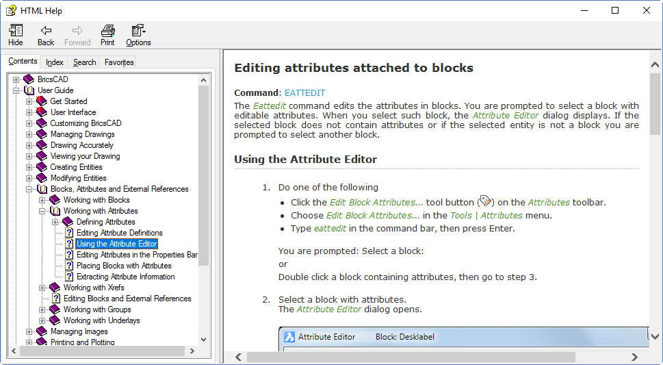
Like the main Help, the BricsCAD online developer reference has a Contents mode with structure:

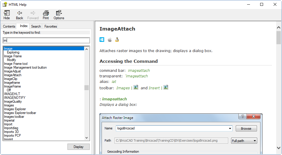
There’s an Index:

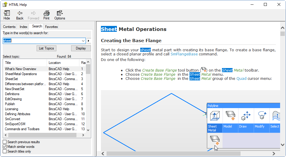
And there’s Search:

As the last image shows, the system contains not only missing information (where’s the (entget) description?) but also broken links; this wasn’t the only 404 I came across. That’s a bit embarrassing, Bricsys. There’s a lot of work to be done yet to bring this up to scratch.

There’s no Favorites section, but of course that’s built into your browser so it would be pointless reproducing that.

Of course, you can’t get context-sensitive help on functions within your LISP code from VLIDE, because BricsCAD has no VLIDE.

Conclusion

The BricsCAD documentation system is notably better than the AutoCAD one in many ways. However, it’s a long way short of perfect. Many aspects need attention, and there are multiple holes to be filled. Sometimes I find myself forced to use AutoCAD’s general documentation system to find out something about a system variable that’s common to both systems. That shouldn’t be necessary.

I’ve hardly mentioned the content of the respective documentation systems, but I must say Autodesk’s content is often superior (thanks, Dieter). But there are exceptions; the BricsCAD descriptions and pictures of various commands and options are better in some cases. For example, try to find out what the various options of the PEdit command do in both systems. With BricsCAD, it’s all laid out on one page and nicely linked.

The AutoCAD command documentation has been pared down too much in places to make each page shorter and simpler, hiding the content beneath sometimes obscure links. It’s possible to find out what the Pedit options do in AutoCAD, but it’s certainly not BricsCAD-easy and I initially gave up after chasing my tail for a while. I went back and found it later, but it took a lucky guess. Giving up after looking through a circular set of links is a common experience with AutoCAD’s Help. There’s a programming concept called mutual recursion, but I don’t want to experience it during a vain search in a Help system, thanks. A visible, navigable structure would help eliminate that issue, but there isn’t one. There needs to be one. Did I mention that already?

With system variables, BricsCAD’s Help is consistently and clearly inferior to AutoCAD’s. The AutoCAD content also tends to be better worded, with the BricsCAD wording being occasionally slightly awkward in a non-native-English-speaking manner. There are also some formatting issues with wide gaps left where the system attempts to expand command descriptions to the right margin and does a poor job of it.

As with AutoCAD, there are many video tutorials available for BricsCAD. I have not considered these in my evaluation but the few I had a look at were pretty good.

Who wins? Nobody. It’s a draw. Both companies need to step up. Autodesk mainly with its awful structure-free system, Bricsys mainly with its incomplete content, particularly for developers. But both companies have work to do in all areas.

BricsCAD documentation – a tale of three systems – part 1

Because of the great similarity between BricsCAD and AutoCAD in terms of commands, variables and most aspects of usage, you would expect the BricsCAD documentation to be about the same too. But it isn’t. Much of the content covers the same areas and due to BricsCAD’s command-line compatibility, there must be a lot in common. But the Help system is very different from Autodesk’s. How so?

In this pair of posts, I describe the BricsCAD documentation system. I assume you’re familiar with the AutoCAD one. In this first part, I describe the general Help system and the descriptions in the Settings command. In part 2, I will discuss developer documentation and draw my conclusions.

General Help

The general Help system in BricsCAD looks a lot like the excellent CHM-based system that AutoCAD had in 2010 and earlier (thanks, Dieter). BricsCAD’s Help is offline by default, included with the standard download and installation, and very fast. Those are great things to have, and AutoCAD lacks them all. But the great thing about the BricsCAD Help system is that it supports different usage patterns, rather than Autodesk’s search-or-nothing method. Rather than telling users that they are expected to use Help in one specific way, Bricsys accommodates their disparate wishes. As usual, the customer-friendly way is the winner.

The BriscCAD system looks a lot more old-fashioned than the AutoCAD one. I don’t care about that. I do care about space-efficiency though, and BricsCAD is the winner there. You can of course resize the dialog and the size of the left pane.

There’s a Contents tab which allows you to navigate the hierarchical structure in which the information is arranged. That’s useful not only when looking for something in particular, but also when using the system as a self-teaching mechanism by working through an area and related topics. AutoCAD completely lacks such a structure.

There’s an Index tab that lists the indexed items in alphabetical order. You can start typing and the indexed items instantly change to reflect what you’ve typed, which is much more efficient than Autodesk’s system. AutoCAD 2018 Help does include an alphabetical list of commands and system variables in both online and offline versions, but it doesn’t give access to all of the topics.

There’s a Search tab that allows you to enter a search term and have several suggestions thrown up. Unlike Autodesk’s system, the suggestions are displayed in a space-efficient manner. Unfortunately, like Autodesk’s search, the suggestions displayed often differ from what you’re after. Even hitting F1 within a command doesn’t take you straight to the page for that command. In PEdit, the F1 visible suggestions don’t include the PEdit command page! It’s there, but needs a scroll down. That really needs work.

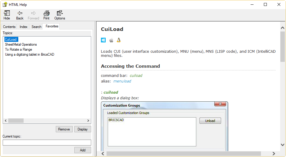
There’s also a Favorites tab where you can save and restore any pages you want to go back to.

But that hierarchical structure is the big winner. Destroying that structure in the AutoCAD 2011 pseudo-browser Help debacle and leaving it broken for seven further releases has to rank among the silliest self-destructive acts Autodesk has ever performed on AutoCAD. Because Bricsys never made that mistake, its general Help system is superior to AutoCAD’s. Until Autodesk throws away its flat-structure mindset and starts again, it has no hope of catching up to the BricsCAD system.

Oh, and your mouse’s forward and back buttons work in the BricsCAD system. How long have we been nagging Autodesk about that? Seriously, how hard could that be?

It’s not all good, though. As mentioned at the top, the AutoCAD content is generally superior. There are also quite a few holes. Enter a system variable at the command line and hit F1. You would expect to get context-sensitive information about that system variable. You don’t. You’re just taken rather uselessly to the “Welcome to BricsCAD” page. This needs attention to ensure context-sensitive help is available for all commands and system variables.

Fire up Help, pick the Index tab and start typing in a system variable name. In most cases, you’ll find it’s not in the list (e.g. FILEDIA). In cases where a system variable name does appear in the list (e.g. FILLMODE), double-clicking on it doesn’t take you to a description of the system variable. Instead, you will be presented with multiple topics and it’s often not clear which is the system variable description.

Settings Descriptions

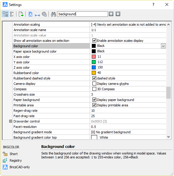
For system variables and most other settings, you’re better off avoiding the main Help system altogether. Instead, use the Settings command. This is like Options in AutoCAD but superior, because it’s all there and arranged much more logically. You can navigate a hierarchical structure to find the setting you want, but you can also type part of the setting name or a related word into the search box at the top of the dialog. If that doesn’t take you immediately to the setting you’re after, you can use the up and down arrows to go to the next match. It’s all very quick and efficient.

Unlike AutoCAD’s Options, you don’t need to go hunting from tab to tab, visually scanning the dialog for the setting you want, which might be hidden under a button or not there at all. Also far superior to AutoCAD, the descriptions don’t hover over the dialog, obscuring what you’re looking at. Dieter has been hacking the AutoCAD dialog hover-tips down in size for years, but they still annoy the heck out of me until I turn them off.

When you find the setting you’re after, a brief description is displayed at the bottom of the dialog. In most cases, this has just the right amount of information you need without having to read through a whole page. If it doesn’t, in some cases it will tell you the setting name. However, this is missing in many cases.

This is a “could do better” area for Bricsys. Somebody needs to go through these descriptions, fill the holes (not a small job) and make them all consistent. While they are at it, get them to tie up all of the missing context-sensitive loose ends in the main system. Better still, provide a button or other method within Settings to take the user to the appropriate Help page. Currently, pressing F1 within the Settings command will give you useful but generic information about using the dialog. Unfortunately, it will not give you information about the setting you want to check or change. That needs to happen.

Click here for Part 2.

AutoCAD 2018 – at last, something to praise

This isn’t supposed to be an Autodesk-bashing blog. Really, it’s not. Sure, Autodesk (and anyone else) gets criticism where deserved. There’s been a lot of that lately, but only because Autodesk has thoroughly deserved it. I don’t make up things so I can have a go; Autodesk provides the material all by itself.

Among other things, I’m a customer advocate. I don’t care who you are, act in an anti-customer manner and I’m going to slam you. Hard but fair. Dish up bullshit to your customers and I will gleefully point that out and heap derision on you. Deal with it.

On the other hand, act in a pro-customer manner and I’m going to praise you. I do praise Autodesk (and anyone else) where deserved. There are dozens of examples of that on this blog. Lately, the pickings have been slim. Time to redress the balance a little.

I’ve mentioned before that Autodesk has some great documentation people, including Lee Ambrosius

…who does a great job with developer documentation. That job’s less visible, but still very important and performed to an excellent standard. Lee is very technically knowledgeable and understands users, developers and their documentation requirements. Within the confines of the systems he’s forced to work with, Lee has done the very best job it would be possible for anyone to do.

Lee has again stepped up to the mark and done exemplary work with the AutoCAD 2018 developer documentation. See Lee’s post for details. This list of AutoLISP changes is an example of the sort of thoughtful addition Lee has provided. Thank you, Lee!

Autodesk has some great documentation people

The most heavily commented post on this blog is AutoCAD 2013 – An Autodesk Help writer responds, featuring Dieter Schlaepfer‘s response to posts and comments here about AutoCAD 2013’s Help. I don’t always agree with Dieter but I respect him enormously, and not just because he was brave enough to stick his head above the parapet in a hostile environment. Dieter is a principal technical writer at Autodesk with many years’ experience and is therefore responsible for large amounts of documentation content. You’ve almost certainly read his work.

I’ve been critical of AutoCAD’s Help system since it was broken in 2011, and I make no apologies for that. The Help system sucked then, it sucked even worse in 2013, and it continues to suck badly in 2017. None of that’s Dieter’s fault. It’s the Help engine that’s at fault, or to be more accurate the Help engines, because the online and offline engines still both suck in various ways. Clearly there’s someone important at Autodesk satisfied with the ongoing Help engine awfulness, but that’s not Dieter. He’s responsible for content, not the engine. Content isn’t the problem. The content is actually very good, and gradually improving as Dieter finds ways to do so. It’s just that the system for accessing that content is so terrible that not many people get to read much of it these days, which is a crying shame.

I digress. Dieter’s awesome.

Also awesome is Lee Ambrosius, who does a great job with developer documentation. That job’s less visible, but still very important and performed to an excellent standard. Lee is very technically knowledgeable and understands users, developers and their documentation requirements. Within the confines of the systems he’s forced to work with, Lee has done the very best job it would be possible for anyone to do.

Everybody knows Lynn Allen, of course. Not just an entertaining and engaging presenter at AU and a thousand smaller gatherings, she has been producing beautifully prepared tips-and-tricks and what’s-new articles, posts and documents for so long she must surely have been a toddler when she started. The value of Lynn to Autodesk and its customers is hard to calculate, but is clearly immense.

Last but not least, Heidi Hewett has done an exemplary job for many years in producing preview guides, posts and other documents. You don’t get to see some of them because they are confined to pre-release testers, but I assure you that they are done to the same high standard as the ones that go public.

The work of our illustrious foursome and other talented writers can be found on the AutoCAD Blog and I’m sure my readers will find something of use there.

AutoCAD 2017 Feature – Share Design View

An interesting new feature of AutoCAD 2017 is Share Design View, which is invoked using the leftmost button on the A360 Ribbon tab or the ONLINEDESIGNSHARE command. The idea behind this command is to create a web-published snapshot of your drawing that can be accessed by anyone with a browser (they’ll need a fairly recent one).

This command works as advertised and provides another option to allow limited access to your design information without providing access to your DWG files. It creates a web page containing a view of your drawing and lets you have the URL (link) so you can access it. You can then share this URL with anyone you want to share the design with. They just follow the URL and can view the design using the Autodesk A360 Viewer (no download required).

Heidi Hewett wrote a fuller description of how it works on the AutoCAD blog that would be pointless to reproduce here.

One caveat: although Autodesk describes the design’s location as secure and anonymous, it’s important to understand that it’s an open location. Anybody with that URL has access to that page. Although the URL is long, complex and probably unguessable, if you email somebody that URL and they start an email forward/reply chain that ends up with other people, all of those people can also access that page and you might never know about it. Also, the index that Autodesk must maintain for all of these pages would be a prime target for hackers looking to steal design content, at which point “secure and anonymous” will be meaningless.

So maybe don’t use this method to share your nuclear plant designs. Also, rescind any sensitive designs as soon as access is no longer needed, in order to limit the exposure time (see About Conferring with Clients and Colleagues Online). The URL stays active for 30 days unless you rescind it earlier.

Autodesk is to be commended for providing this feature and documenting it well and honestly. There is little evidence of the misleading hype about security that tainted Autodesk’s DWF marketing back in the day. Here’s a Cloud-based feature that adds value to AutoCAD with little or no downside. Just be aware of its semi-open nature and use it appropriately.

Note: this feature requires A360 to be selected during installation or deployment creation (which it is by default). If A360 is not installed, the Share Design View button will be greyed out. The command will still exist and will attempt to connect to A360 but will then fail with a Service Unavailable message.

AutoCAD Help suckage to continue – confirmed

In a recent post on Between the Lines, Shaan passed on the following response from the AutoCAD Team:

There has been some recent discussions about the built-in help system in AutoCAD 2013, both positive and some criticism.  As our longtime users know, AutoCAD help has been through many evolutions.

We are particularly proud of the new AutoCAD 2013 online learning environment we recently released (AutoCAD Online Help Mid-Year Updates.) This update addressed several user requested fixes and changes, and we will continue to take our direction from our user’s feedback.

We do recognize that the online learning environment may not be the solution for every user, so while we are focused on creating a rich and personalized online experience, we will continue to maintain our current basic offline experience.

(The emphasis is mine). This statement, although couched in marketingspeak, confirms what I’ve had to say on the subject. Here’s my translation into plain English:

AutoCAD 2013 Help sucked, the customers said so, the recent update improved matters somewhat for online users, but the awful old system stays in place for offline users. The offline system is in maintenance mode, and the experience will continue to remain basic (i.e. it will suck long-term).

There’s no mention of correcting this situation; it’s clearly a matter of policy rather than some unfortunate accident.

Today, I was using Autodesk Navisworks Manage 2013. As you might expect from an Autodesk product, it’s powerful but unstable. In addition to the lockups and crashes, it has various bugs and annoyances. In looking for a way of working around one of the annoyances, I delved into the Help system. Strangely enough, this product (much younger than AutoCAD) uses something that looks remarkably like an old-fashioned CHM-based Help system. It worked offline. It was quick. It had contents, search and index tabs, and they worked on a Windows 7 64-bit system. It had a hierarchical structure and a breadcrumb bar that helped me understand the context of what I was reading. Using it was, in short, a breath of fresh air.

Memo to Autodesk: if you’re going to try to make online Help look good by mangling offline help, you’re going to have to do this to all your products at once to make it remotely convincing.

The Hitchhiker’s Guide to AutoCAD explained

Following my comments on The Hitchhiker’s Guide to AutoCAD, Autodesk’s Dieter Schlapfer has sought to explain the reasoning behind it. Here’s what he has to say:

As mentioned previously, The Hitchhiker’s Guide to AutoCAD is designed for occasional AutoCAD users and those coming back from their initial training. These are people who just need a base level of knowledge in 2D AutoCAD to get things done, and who don’t necessarily want to become experts. To make future versions more effective, I really want to get some input on the 42 AutoCAD commands, and any descriptions or illustrations that are not clear. Especially valuable to me is feedback coming from occasional users.

Here’s some history. Believe it or not, the 42 commands came first! I kept flaunting this number, which was based on an internal AutoCAD overview class that I taught a while back, in response to people who complained about how hard it is to learn AutoCAD. Based on that interesting number, two of my colleagues made the connection to the Hitchhiker’s Guide to the Galaxy, the title of which was based on Ken Welch’s book, Hitchhiker’s Guide to Europe (I have the 1986 edition).

Creating a hitchhiker’s guide to AutoCAD was a terrific idea and the next thing I knew, I was writing it. Most of the 42 commands were no-brainer choices, but there were several that I knew would be controversial among experienced AutoCAD users. Based on internal feedback and CIP popularity, I made a number of revisions to my original list but I’m open to being persuaded to make additional changes.

My biggest challenge was handling scaling and layouts. As you know, there are four primary ways to annotate drawings. It was tough, but I ended up choosing the one that was easiest to learn, the trans-spatial method, while giving a nod to the others.

Again, I’m looking for feedback from relatively new and occasional users. Where exactly is the guide weak or confusing, including any illustrations? I already have some things that I definitely want to change moving forward, but if any of you find someone willing to try it out, or if you have strong opinions about something in the guide, please let me know either here or email me directly at dieters@youknowwho.com (for the bots).

Should Autodesk provide a CHM version of its AutoCAD 2013 Help?

I’ve added a poll asking this question over on the right. I would like to see this done as soon as possible as a courtesy for those customers who find the current AutoCAD 2013 Help system inadequate. If you agree, vote Yes. If you disagree (for example, you think Autodesk should instead concentrate on improving the current system), vote No. If you wish to make a comment on this specific issue, feel free.

AutoCAD 2013 – An Autodesk Help writer responds

Following some email discussions, I am happy to present a response from a relevant Autodesk person to the posts and comments here about AutoCAD 2013’s Help.

Thanks for the opportunity to respond to your readers, Steve.

First, I want to assure you that we’re listening to your comments about AutoCAD 2013 Help. We are adding it to the valuable feedback we’ve already received from users who participated in our Beta program. I responded promptly to every comment from each Beta user and will now address a wider audience.

Here are some of the trends we’ve seen so far in the suggestions users are making about AutoCAD Help:

  • Additional navigation to supplement our Search function
  • Alphabetical listings of AutoCAD commands and system variables
  • Improved precision from the Search function
  • Access to information about new features

We are working right now on our update plans. We invite your additional comments about any other problems you’ve had so that we can have a broad view of your needs as we define the scope of our update.

I’m glad to say that Help updates will no longer have to wait until the next product release. I’d also like to emphasize that the software industry, Autodesk included, is trending toward online delivery of both software and documentation, and that these technology changes pose significant challenges to all of us.

We always appreciate your feedback and we take it seriously.

Thanks and best regards,

Dieter Schlaepfer
Principal Content Developer
Autodesk, Inc.

As Dieter suggests, please comment here with your problems and suggestions. Please be as brutally honest as you wish about Autodesk, its offerings and its future plans. However, I ask that you remain civil. I have ‘known’ Dieter on-line for about 20 years and can attest to his integrity, intelligence and intense desire to do the best job possible. He did indeed respond very fully and honestly to the comments made by myself and others during the Beta program and in our emails. He may very well be the best listener I’ve ever come across, in any context.

In short, Dieter’s one of the good guys and he’s doing a brave thing here. Let him know what you really think, but please don’t beat him up.

AutoCAD 2013 – Using Help in anger

Trying to be fair, I decided to put aside my initial hostility to the AutoCAD 2013 Help system and use it for real. I used it in a realistic situation, to find out how to work with something new or changed (model documentation) as I was working through it with my own example drawing. Try as I might to give it a fair go, I could only get so far before I got irritated. Using it in anger might not be an entirely appropriate phrase for it, but it’s not that far off. Using it in annoyance, perhaps? Here’s how it went.

I hit F1, wait for it to finish loading itself, click in the search box (because that’s not where the focus is to start with), type ‘model documentation’ and pick Search (because Enter doesn’t work). I then wait again, for about 10 seconds, even though I’ve configured it for offline use. Eventually, there is a huge mass of results displayed, almost all of which are totally (totally!) irrelevant to model documentation. Most of them are relevant only to ARX programmers dealing with completely unrelated matters.

If I use the “phrase” option rather than “and”, the list is much shorter and has a much higher proportion of results that have some relevance, but there are still completely pointless results. For example, the 4th result is About Performance Considerations (AutoLISP), which does not contain the phrase at all. It does contain the words ModelSpace and Document, but not together. It does not contain any information remotely related to model documentation. Didn’t Autodesk buy a search technology company a while back? If that company’s technology is in use here, then Autodesk bought a dud.

At least the top two results directly relate to what I need, so I’ll move on with those. They are Commands for Working With Model Documentation Drawing Views and About Model Documentation. The content of the former page is OK; it’s just a list of commands. There is some pointlessly wasted space at the top of the page that means I have to scroll down to see the bottom of the list, but other than that it serves as a useful reference. The latter page is also fine. It’s an executive summary of the feature with a few relevant pictures, followed by a decent set of links pointing to relevant pages that expand on the subject and explain how to do various tasks associated with it. Now I have overcome the inadequacies of Search and determined that useful Help content is all there, that’s all good then, isn’t it? Not really, I’m afraid.

If Help was being run from a real browser, I’d be able to keep both of those starting pages open with their useful links, then middle-click on each of them as needed to open each useful page in a new tab. However, Help isn’t being run like that. It’s being run from inside Autodesk’s pseudo-browser thing, which only allows one page at a time to be displayed. To be fair, this restriction also applies to the old CHM-based Help to some extent. However, the old CHM Help is split into multiple sections, and it is possible to have multiple CHMs each open in their own windows. For example, I can have the AutoCAD 2010 main Help and Developer Documentation open at the same time, something that’s very important for my productivity and which I would find extremely difficult to give up.

To work around the tabless nature of 2013 Help, I need to choose one particular page and stick to it. When I need another page, I need to navigate back up to one of the original links pages and then back down again. That would be bad enough if navigation within the pseudo-browser was good, but unfortunately it isn’t. Despite what looks like a breadcrumb feature at the top of the page, this is non-functional because of the lack of a hierarchical structure to the content. It just keeps taunting me by saying ‘Home’ and nothing else, pointlessly wasting a swathe of vertical space. There are back and forward buttons in that space, but the back and forward mouse buttons I can use everywhere else do nothing in this browser. You can use Alt+Left and Alt+Right to back and forward. Don’t go too far back, though! If you do, the Search panel goes blank and can’t be restored by going forward again, or by switching between Favorites and Search. To fix this, you can close and restart Help , or pick the Home button and wait about 6 seconds for it to get its act together and restore the Search panel. Then you’ll be at the home page, which may not be where you wanted to go back to.

All right, so I have chosen the single page I’m allowed to have open and I want to use the features it describes. This test PC only has a single 1280 x 1024 screen so there really isn’t room for both AutoCAD and Help at the same time, a situation that will be familiar to users of notebooks. I click on the AutoCAD drawing area behind the Help window, expecting AutoCAD to come to the top and to go behind it. Nothing happens, other than Help losing focus. Help stays on top, obscuring the drawing area. If I click the main AutoCAD taskbar button (this is in XP), that minimizes both Help and AutoCAD. Restoring AutoCAD also restores Help, so it still obscures the drawing area. The two windows are linked, and not in a good way for somebody with one screen. I guess some users will want Help to stay on top, but there are plenty of others who won’t, so what could Autodesk have done to keep everybody happy? Made it configurable, obviously.

Eventually I worked out that I could work on AutoCAD if I explicitly minimised the Help window, so away I went. I used the Commands for Working… page, then the VIEWBASE page to start my model documentation experiment. I then picked another link from the VIEWBASE page, the Drawing View Creation Ribbon Contextual Tab page. Having finished with that, I wanted to get back to the Commands for Working… page, so instead of picking multiple Back buttons (which as noted above is fraught with danger if you do it too often), I clicked on that result in the Search panel on the left. Did this take me back to the Commands for Working… page? No, it did not. It did nothing at all. To make it work I had to click another search result first, and only then the one I really wanted.

One saving grace is that I discovered that if I right-clicked on a link in Help, I could copy the URL and then paste it into a proper browser. This works both on and offline, and allowed me to work around many of the problems noted above. This kludge doesn’t work for search results, though, only for links in pages.

I’ve given AutoCAD 2013 Help a decent go, as much as the average reasonable person would before giving up. Maybe more so. I feel pretty comfortable about giving it what I consider a fair assessment. The content of the Help pages itself looks pretty good to me, at least for those pages I visited and the context in which I was using them. If you already know what command you’re supposed to be using, you just hit F1 from within that command to get at the page you want and you don’t need to go any further, you could well be satisfied. But if you’re using the system in any other way, there’s no getting away from it, it’s a crock. The content is not the problem, it’s the loss of structure to that content, and the browser thing being used to present that content. That loss of structure was A Bad Idea and the browser is a very poor effort. The system as a whole should not have been inflicted on customers.

As a courtesy, Autodesk should do what it did following the 2011 Help debacle and provide a CHM solution for customers to download. It should then go on providing a CHM solution indefinitely, until it can come up with something that is of comparable quality. People are already talking about making their own 2013 CHMs. Autodesk, please do the right thing and save them the bother; let us all know that you’re going to provide CHM as a workaround and get it to us as soon as you can. Don’t worry about losing face by admitting that the 2013 Help isn’t up to scratch. It’s too late for that; we’ve already noticed.

AutoCAD 2013 – Help improved in one area

There’s one important area in which AutoCAD 2013’s Help shines when compared with its immediate predecessors. If you’re a Visual LISP user, you’ll be pleased to know that if you select a function name in the editor (e.g. (vla-get-ActiveDocument)) and hit Ctrl+F1, this now takes you to the appropriate page in the ActiveX and VBA Reference, as it should. In AutoCAD 2011 you just got a cryptic message or a 404 error, depending on the context. In AutoCAD 2012, you were just taken to the front page of Help and expected to find it yourself. Props to Autodesk for fixing this problem.

As a bonus, the reference you’re taken to is still a CHM so it works nicely. The Search tab doesn’t work in Windows 7, but that applies to all CHM Help and it’s Microsoft’s fault, not Autodesk’s. The structured contents and index are fully functional, which makes the whole thing usable even without the search facility.

AutoCAD 2013 – Autodesk video tutorial for Help

Autodesk has produced a 2-minute video explaining the features of the new Help system in AutoCAD 2013 that I recently panned. As you might expect, it’s kind of upbeat and chirpy, but the fact that Autodesk feels the need to provide a tutorial on how to use Help says it all, really. Whatever, it may be useful to you, so here it is. It’s hosted on the Autodesk site, unlike many other Autodesk videos (and my own, to be fair), so those of you who have YouTube blocked at work may still be able to watch it.

If you’re having trouble watching the tutorial, don’t panic. I expect Autodesk will soon produce another tutorial explaining how to use the tutorial explaining how to use Help explaining how to use the product to actually do work.

AutoCAD 2013 – Autodesk pulls off a miracle with Help

In AutoCAD 2011, Autodesk introduced on-line Help. It was badly done and poorly received. It was slow and generally awful to use, and so obviously inferior to the generally well-crafted old CHM-based system in so many ways, that there were squeals of joy when somebody discovered that one of the AutoCAD-based vertical products hadn’t been updated to the new regime and still provided a CHM file. That file became hot property, being posted by users on Autodesk’s own discussion groups and other places. Eventually, the outcry was loud enough that Autodesk was forced to make the CHM version of Help available for download. Those of us who actually use the documentation from time to time (or support people who do) breathed a sigh of relief and got on with our work, grateful that Autodesk had seen the error of its ways. But had it, really?

No. In AutoCAD 2012, Help was not only online, but integrated with AutoCAD Exchange in Autodesk’s dodgy version of a pseudo-browser. How good is Autodesk at writing browsers? About as good as you’d expect, sadly. No AutoCAD 2012 CHM was provided with the product at launch time, or even later as a download.

So how well did this new and improved attempt at on-line Help go down with the punters? In my poll on the worst AutoCAD features of all time, Help (on line / 2012) came in third, which gives you some idea. Third worst of all time! That’s a really, really bad place to be. There’s only one place to go from there, surely?

With AutoCAD 2013, Autodesk has wrought a miracle, taking this terrible failure of a system and completely revamping it. Somehow, incredibly, impossibly, Autodesk has managed to make it even worse. Not slightly worse, either. Much worse. AutoCAD Help has been plucked from the depths of mediocrity and plunged deeper still, to a dark place where the pressure of awfulness is so great that spontaneous implosion is a real risk.

Enough rhetoric, what’s actually wrong with it?

  1. It’s online by default. That means it’s slow and can’t possibly be 100% reliable. This is an example of Autodesk pushing its ‘vision’ at the expense of the practical needs of its customers. Nothing new there, then.
  2. Like many of Autodesk software’s attempts to access the Internet, it has been written poorly, such that it attempts to access IPs directly instead of using calls that will work correctly through a proxy server with firewall. As a result, it fails completely in some secure corporate environments. Mine, for example.
  3. Never mind, let’s just go and tell it to use the offline version instead. Turn off the Options > System > Help and Welcome Screen > Access online content when available toggle, hit F1 and see what happens. This does:
    What? You mean it’s not already installed? I have to download and install it separately myself? To be fair, during installation, you are kind of warned about this with a little information glyph. Hover over it and you will see this:OK, for an individual user that’s a drag, but for a CAD Manager with a large number of computers to set up, that’s way beyond inconvenient. Not to mention a user that’s in a location where online access is expensive, intermittent and/or absent. It would not have been at all hard to include offline Help in a 2013 install, and the fact that a deliberate decision was made to not do so smacks of arrogance. Assuming this worked properly, this situation would reflect pretty badly on Autodesk. But it’s worse than that; read on.
  4. Once the offline Help has been downloaded and installed, let’s try hitting F1 again.  This is what I saw:A little investigative work proved that the Help files were not located in the C:\Program Files\Autodesk\AutoCAD 2013\Help location, but rather in C:\Program Files\Autodesk\AutoCAD 2013 Help\English\Help. That’s right, Autodesk requires you to perform two installations, one of which apparently places files in a different location from that in which the other will go looking. Luckily, instead of going round moving files or changing settings, I just restarted AutoCAD and the problem went away. It’s quite possible I would never have seen the problem if I had done the second installation while AutoCAD wasn’t running, but it’s quite likely that many users will download and install in exactly that situation. The result is confusion, the impression given is amateurish.
  5. When you finally do get to get something other than error messages, this is it:Where’s the User Guide? Command Reference? Customization Guide? Gone. There’s no structure to it. It’s basically just a huge mass of web pages you’re expected to search through. There is no index, no contents, no list of commands, nothing. You want to find Help on something, you go search for it. Not sure exactly what the name is of the feature or command you’re searching for? Bad luck.
  6. You know what Autodesk’s search mechanisms are like, right? Yes, this one sucks too. Beginner? Want to draw a line? In AutoCAD 2010, in the Index tab, start typing LINE and the item appears at the top of the list. Double-click it and you’re there. In AutoCAD 2013, enter LINE in the search box, pick the button and this is what you see:

    So where’s the LINE command? It’s not even on the first page of results. You need to scroll down to find it. No, I’m not kidding. To add insult to injury, unlike every other Windows scroll bar I’ve seen, the one in the search results panel doesn’t page down when you click under the button, it just scrolls a single line at a time. It was probably pretty hard to program it to do that.
  7. Once you’ve got to a page and you want to get around a bit, usability is poor. By default, the search item is highlighted so the title of the LINE page, for example, will display as white on a yellow background. Very readable. There is a general lack of controls, and navigation is awkward and slow. Without a hierarchical structure and no breadcrumb feature, it’s difficult to get an idea where you are and what subjects might also be useful to look at. The tabs that we had in 2010 are gone. There are links to related references and concepts, but they’re at the bottom of each page. If you can see that the page you’re in is not useful to you, you have a bunch of scrolling to before you get to those links. The back and forward buttons on my mouse don’t work here, although they work fine everywhere else.

I could go on and on with the faults, but this post is already a monster so I’ll stop there. It’s difficult to think of ways in which this could have been done worse, but I’m sure Autodesk is working on it for 2014. Seriously, this is just embarrassing.

Autodesk, it’s not as if your software is cheap or sells in tiny quantities. You’re not short of the resources you need to do a good job, yet your AutoCAD Help system is so ridiculously inferior to that of numerous freeware and shareware applications that it’s not funny. What on earth were you thinking when you spewed out this rubbish? Did you think we wouldn’t notice?

You obviously want to convince your customer base that you’re all on-line trendy and capable of providing great Internet-based solutions that will have people flocking to use your Cloud stuff. OK, start by getting your finger out and making this stuff work. After three releases, you can’t do an acceptable job at something so seemingly tailor-made for online use as a bunch of text, images and video (which pretty much describes the World Wide Web). What kind of job can you be trusted to do with something much more difficult, such as CAD on the Cloud?

Autodesk provides CHM-based Help for AutoCAD 2011

In a comment in response to my AutoCAD 2011 Help system is not popular post, Autodesk’s Diane Serda acknowledged the problems, offered apologies and posted a link to a CHM version of the Help. From Diane’s comment:

We have posted the zip file for download here: http://usa.autodesk.com/adsk/servlet/ps/dl/item?id=15068206&siteID=123112&linkID=9240618

Instructions:
1. Download the AutoCAD2011CHMHelp.zip to your local drive (such as My Documents\AutoCAD2011Help).
2. Extract the zip file to this same folder.
3. To access the CHM Help, you’ll need to click on acad181.chm or create a desktop shortcut.

You can also point to the locally installed HTML help by turning on the local help checkbox under Options, System. You can also access the PDF’s from the Online Help Home page under Online Resources. http://docs.autodesk.com/ACD/2011/ENU

Thanks, Diane! That saves people from having to do inconvenient and dodgy things like downloading a demo version of an AutoCAD 2011-based vertical (Civil 3D 2011 has CHM-based Help for the AutoCAD bits) and grabbing the CHM out of there.

Edit: when running under Windows 7 64-bit, the Search pane is blank, as it is in the CHM Help for earlier releases. That’s unfortunate, because searching is a major thing at which the browser-based system is currently very poor. The Index panel works, though, and it’s quick.

The PDF link is currently broken for me, but I expect it will be working before too long. In the meantime, the direct link to the list of available AutoCAD 2011 PDF documentation is http://docs.autodesk.com/ACD/2011/ENU/pdfs/PDF Documentation.html (beware, space in URL).

Autodesk Knowledge Base – rapid response converts fail to win

Credit where credit is due. Following my rant about the uselessness of using a 16-minute YouTube video as the AutoCAD 2011 system requirements resource, the relevant people at Autodesk quickly fixed it and let me know.

Now we just need the other releases covered and we’ll be all set. Autodesk is still officially supporting AutoCAD releases back to 2008, and those people who parted with a big slab of cash a decade ago are Autodesk customers, too. I’m sure Autodesk would like potential new buyers of its current products to know that they will be at least minimally looked after in future.

I commend Autodesk’s Leo Casado for reacting politely and constructively to what was undoubtedly harsh feedback. Some Adeskers (by no means all) have been known to get extremely defensive when faced with criticism, insisting that all feedback should be expressed constructively. That’s nonsense, of course. Frank expressions of viewpoints are essential in order to resolve problems. Negative feedback, including harsh criticism, can be among the most useful forms of communication. Congratulations to Leo for showing how it can be handled positively, to the benefit of all.

Autodesk Knowledge Base – who thought this was a good idea?

This evening, I needed to know exactly which operating systems were supported by all AutoCAD releases from 2004 to 2011 inclusive. I have a pretty good idea, but I needed to confirm that my mental picture is completely correct. So I hopped over to the Autodesk Knowledge Base and entered “system requirements” in the search engine. Only one of the first 50 results was relevant, and that was for AutoCAD 2011. So I clicked on that. Did I get an easily digestible list of system requirements, including a list of exactly which operating systems were supported by AutoCAD 2011? No, I did not.

What I got was this:

AutoCAD 2011 System Requirements Knowledge Base Entry

So I clicked on the pretty picture, hoping to be taken to an easily digestible list of system requirements, including a list of exactly which operating systems were supported. Is that where I was taken? No, it was not.

Instead, I was taken to a 16-minute YouTube video. As I was not being blocked by a business firewall at the time, I could watch a few stuttery, blurry marketing images flash past during the few seconds it stayed on my screen. There’s a technical term for this kind of thing. It begins with w and rhymes with bank.

But I don’t need to tell you how dumb this is. Anybody who is smart enough to read this blog can work that out. But the people at Autodesk who thought this was a great idea? Really, what on earth were they thinking? What were they smoking? Strewth!